Why We Introduced a Design Review Checklist
As Fresh Prints continued to grow, so did the complexity of our product ecosystem. More designers were contributing across multiple teams, new features were being launched faster, and maintaining consistency became increasingly challenging.
As Fresh Prints grew
To support this growth, we introduced a Design System—a shared foundation of components, typography, colours, spacing standards, and interaction patterns. The goal was simple: create a common language that would help designers build consistent experiences more efficiently. The Design System gave teams a clear set of standards. But after several review cycles, I noticed an important gap.
Even though designers had access to the right components and guidelines, many reviews were still uncovering the same issues:
- Inconsistent spacing and layouts
- Missing empty and error states
- Accessibility concerns
- Incorrect component usage
- Unclear content hierarchy
- Design system standards being overlooked
The issue wasn't a lack of knowledge. The issue was that as products become more complex, it's unrealistic to expect designers to remember every design principle, accessibility requirement, and system guideline during every project.
That's when I realised something important:
A Design System tells teams what to use. A Review System helps teams use it consistently.
The Inspiration
While researching how mature design organisations maintain quality at scale, I noticed a common pattern. The best teams don't rely on memory. They rely on systems. Pilots use pre-flight checklists before takeoff. Surgeons use checklists before procedures. Engineers use deployment checklists before releasing software.
Not because they lack expertise, but because consistency matters more than memory. That idea resonated deeply with me.
Instead of treating design reviews as the place where quality issues were discovered, what if we could help designers identify those issues before the review even started?
What if reviews could focus on product thinking rather than quality control?
Designing the Checklist
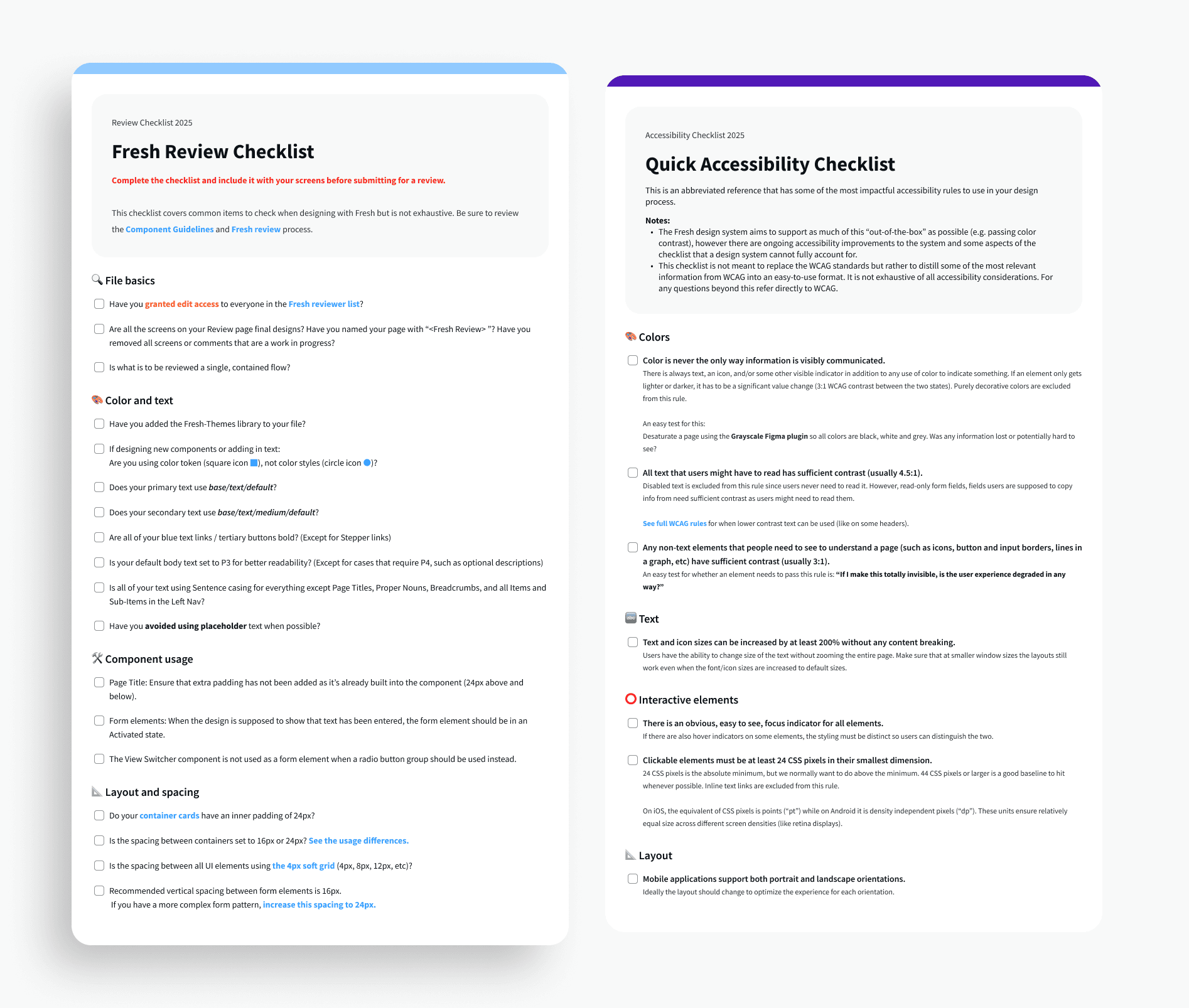
As we launched the Design System, I introduced a Design Review Checklist to act as a quality gate before any design entered formal review. The objective wasn't to add more process. The objective was to reduce review cycles, improve consistency, and create a shared definition of quality across the organisation.
The checklist focused on recurring themes that frequently surfaced during reviews:
| Design System Adoption |
|
|---|---|
| Accessibility |
|
| Content Quality |
|
| Experience Quality |
|
Instead of relying on memory, designers now had a simple framework to self-review their work.
Building a Review Process Around the Checklist
Creating the checklist was only the first step. For it to be successful, it needed to become part of the team's workflow. Rather than introducing another manual approval process, I designed a lightweight review system around it.
Before requesting a design review, every designer would:
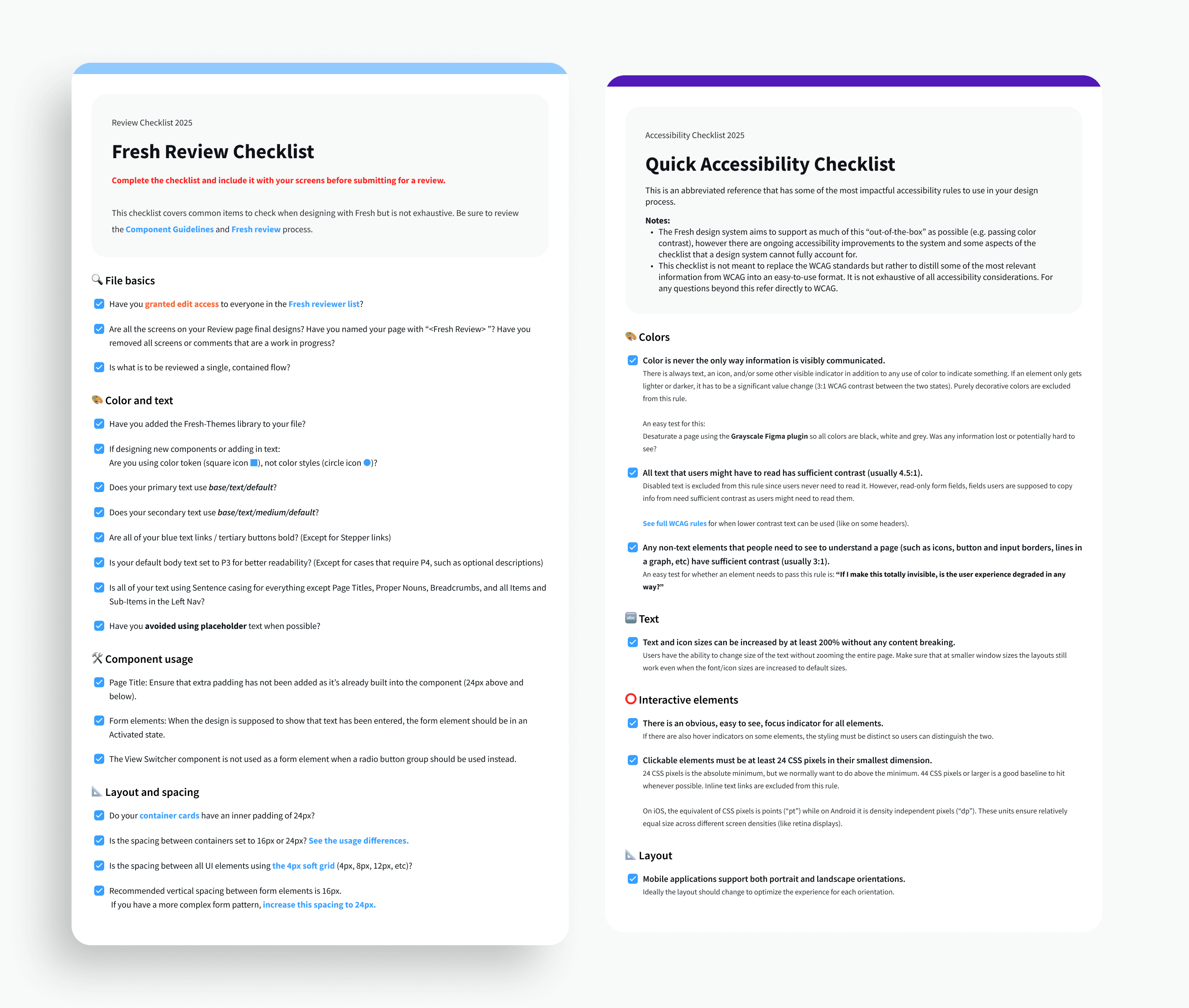
Complete the Checklist
Designers reviewed their work against the checklist and confirmed that each requirement had been addressed.
This encouraged self-review and helped identify issues early in the process.
Submit Through a Review Form
Once completed, designers submitted their work through a Google Form.
The submission included:
- Designer Name
- Team Name
- Email Address
- Link to Figma File
- Brief Overview of the Feature or Flow
- Completed Checklist (Y/N)
The overview section was particularly valuable because it provided reviewers with context before opening the design file.
Instead of immediately jumping into screens, reviewers could understand:
- What problem was being solved
- Which users were impacted
- What changes were introduced
- Any important constraints or considerations
Automated Submission Confirmation
After submission, the designer received a confirmation email, ensuring there was clear visibility into the review process.
This reduced uncertainty around review status and created a record of submissions.
Design System Team Review
A member of the Design System team would then review the submission.
Their review focused on:
- Design System compliance
- Accessibility requirements
- Consistency across patterns
- Overall experience quality
Depending on the outcome, the submission would receive:
- Feedback for improvements
- Requests for revisions
- Final approval
This created a structured yet lightweight quality assurance process that scaled across teams without creating unnecessary bottlenecks.
The Review Workflow
The final workflow looked like this:
- Design Exploration
- Self Review Using Checklist
- Google Form Submission
- Design System Team Review
- Feedback or Approval
- Design Handoff & Implementation
By introducing this process, quality became part of the workflow instead of being dependent on individual reviewers.
What Changed
The impact became visible within a few review cycles. Design reviews became more focused and productive.
Instead of spending time identifying basic issues such as spacing inconsistencies, accessibility gaps, or missing states, conversations shifted toward more strategic topics:
- User behaviour
- Product decisions
- Business goals
- Trade-offs
- Experiment opportunities
The checklist also created a shared understanding of what "review ready" meant. New designers onboarded faster because expectations were documented. Teams became more confident in their submissions. The Design System gained stronger adoption because designers were actively validating their work against it.
Most importantly, quality became more consistent across teams. Not because reviewers worked harder. But because the process made quality easier to achieve.
Lessons Learned
One of the biggest lessons from this initiative was that Design Systems alone don't create consistency.
People, processes, and habits create consistency. The Design System provided the building blocks. The Review Checklist provided accountability. The Review Workflow ensured adoption. Together, they formed a scalable quality framework that helped FreshPrints maintain design excellence as the organisation continued to grow.
And while users never saw the checklist itself, they experienced its impact every time they interacted with a more consistent, accessible, and thoughtfully designed product. Sometimes the most valuable design work isn't designing another screen. It's designing the systems that help an entire team create better experiences.